Lesson 7: Data Visualization and Infographics
Infographic Design
In the previous section you learned how to create an infographic on a more conceptual level. In this section you will learn how to create an infographic on a more practical level. After you have thought about your target audience, purpose, visual design, and ways to present your data in accurate and interesting ways, you may want to start to create your infographic.
Computer programs
You can use a wide variety of tools to do so. While a program like Adobe Illustrator is rather expensive, others, such as Inkscape are free to use. You would be surprised to what extent you can even use PowerPoint to create beautiful infographics. To learn more about the programs and tools you can use to create infographics, please read Chapter 7: Design Resources from the Randy Krum’s book Cool infographics: Effective Communication With Data Visualization and Design. You can access Randy Krum’s book via this link. You need to select the "Not listed? Click here" in the "Select your institution" list, then sign-in the O'Reilly website with your VT email address. If it is the first time for you to use the O'Reilly books with your VT email address, you may need to sign up.
Creating infographics using vectors
Randy Krum (2014) mentioned that designers of infographics generally work with vectors. He states that the main advantage of vector graphics is that they can be resized without losing any resolution or clarity. If you have never used vectors, you may not understand how you can use them. Therefore please read the Vector FAQ below.
- After you have pasted your .emf file into PowerPoint, go to format > group (on the right side) > ungroup. You may now get a notice that says “This is an imported picture, not a group. Do you want to convert it to a Microsoft Office drawing object?” Click “Yes”. Again click format > group > ungroup. Your image should now be divided into individual objects. Simply select the ones you would like to use, and delete the others.
- If the first option does not work, try this option: Open Illustrator or Inkscape and follow these steps.
- Select the objects you would like to use (if all objects are selected when clicking on a single object, simply right click on your object > click ungroup).
- Ctrl + C (Copy) (use Command instead of Ctrl on a Mac)
- Ctrl + N (New file)
- Ctrl + V (Paste)
- For Illustrator (file > export > .emf) For Inkscape (file > save as > .emf).
- Paste your .emf file into PowerPoint.
Using online tools
It is also possible to use online tools such as Easel.ly, Infogr.am, or Piktochart to create your infographic. While these are intuitive tools that do not require much time to learn, keep in mind that these programs usually have limited templates and exporting options available. In addition, they often force you to include their watermark and they may only let you download your infographic in a lower resolution. Before using any of these tools, it is therefore important to make sure that you can use it for your purposes.
Color schemes
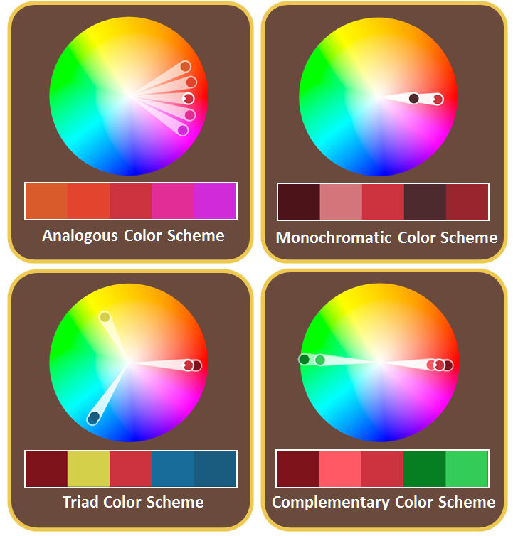
When you look at infographics, you often notice that they use specific colors. Usually they use a consistent color scheme throughout the infographic. There are many different color schemes. For example, an analogous color scheme uses colors that are next to each other on the color wheel. A monochromatic color scheme on the other hand, uses specific tints, tones, and shades within one specific hue (for example red). Another type of color scheme is the triad color scheme. It uses three colors that are spaced equally around a color wheel. The complementary color scheme uses two colors that are on opposite ends of a color wheel. In addition to these four types of color schemes, there are many other possible combinations you can use. You can play with these color schemes using websites such as Adobe Color CC. In addition to using a color wheel, you can also use resources such as ColourLovers for ideas and inspiration. ColourLovers allows you to look for color schemes by keywords. Similar to Adobe Color CC, it also allows you to upload an image you like to find a matching color scheme (Tools > Photocopa). When you select a color scheme, think about how they align with the needs of your target audience and the overall message you would like to convey. For example, analogous color schemes better match calm and peaceful environments while complementary color schemes generally tend to create a more vibrant look.
When designing color schemes, it is important to also think about the accessibility of your graphics to people who are color blind. There are several vision simulators you can use to check what your colors look like to color blind people. An example is Paletton.
Assignment 7
Description
- Choose a topic that relates to your professional or personal life and find a reliable set of data that you would like to represent visually.
- Choose a target audience and the message or story you would like to tell them about your chosen topic and data.
- After sketching out a design, create your design using Adobe Illustrator, Inkscape, PowerPoint, or another tool. Visualize your data as much as possible. As Krum (2014) states, large fonts are not visualizations. Make sure that you think about and take advantage of visual elements such as lines, shapes, colors, captions, graphs, vector images, arrows, and charts to get your message across. You will be asked to justify your choices later, so please make every decision carefully. For ideas and inspiration you can find good infographics here.
- Save your file as a .png or .jpg file.
- Paste your infographic into a Microsoft PowerPoint file. You can adjust the slide dimensions of your PowerPoint file to make your infographic fit (go to design > page setup > choose your dimensions).
After you have completed your infographic, please answer the following two questions in the notes section of PowerPoint, using approximately 2-3 paragraphs per question.
- Who is your target audience and how did you take advantage of specific color schemes, style, language, and tone to appeal to your target audience?
- What is the main story or message you wanted to convey and how did you take advantage of visual elements (such as lines, shapes, captions, graphs, images) to get your message across?
Submitting Your Assignment
At the end of this lesson you will submit your completed assignment. Assignment 7 should be prepared using Microsoft PowerPoint. At the top of the notes in your PowerPoint file, you should have the lesson name, and underneath that should be your name, email address, and the date. When you save the document as a file on your computer, make sure the file is named “Assignment7”. After you have saved your file, go to the student interface and submit your assignment for grading. Click here if you need additional information regarding the submission of your assignment.
Grading Criteria
- The infographic makes the data more meaningful and accessible to the target audience. It goes beyond the display of a collection of statistics, list of images, or a group of large numbers with supporting graphics. (6)
- Visual elements (such as vector images, lines, shapes, colors, captions, graphs, arrows, and charts) were used effectively to get the main message across to the target audience. (6)
- The infographic is self-contained and does not require an explanation. (3)
- Direct references to specific resources and data sets that you used are included in your infographic (e.g. at the bottom of your infographic). (2)
- Explained who the target audience is and the relationship between the target audience and use of color schemes, style, language, and tone. (4)
- Explained the main story or message you tried to convey and how you took advantage of visual elements to convey this message. (4)
Points: 25